2.4K
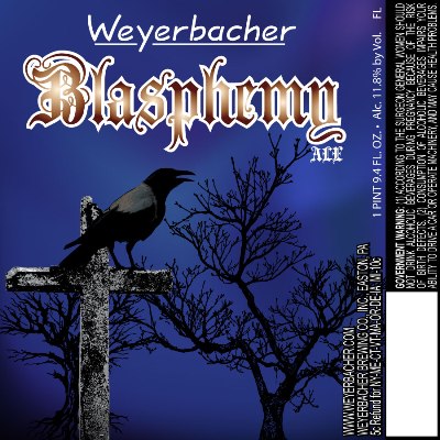
Edit: We were just informed by Weyerbacher that this is a stopgap between their old design and their official redesign. Once they get their new logo they’ll be doing it again. Thanks for the clarification!
As we mentioned in last week’s Appetizer, Weyerbacher Brewing Company in Easton is revising their bottle labels. Below is a comparison of the old Blasphemy (top) and the new Blasphemy label (bottom). Blasphemy has been missing from the market for about three years so this will mark the return of a coveted beer. It’s their Quad beer aged in bourbon barrels and should be out sometime in May. What do you think of the new label?


1 comment
The new label definitely looks better, but goddamn do I hate that Weyerbacher font. They desperately need to pay a graphic designer to come up with a new one. Maybe they should have a design contest. In any case, someone needs to break the news to them gently that their font totally sucks.